
Closing the loop on Promotions
Role
Lead Product Designer (sole designer)
Team
Product, Engineering, Marketing
Timeline
~8 weeks (iterative rollout)
Platform
Mobile app (consumer-facing product)
Problem
Promotions were underutilized, poorly surfaced, and failed to clearly communicate value or reward status to users.
Outcome
- Designed an end-to-end promotions system spanning discovery, engagement, and reward distribution across the app
- Improved user clarity around active promotions and reward status
- Created a scalable foundation for future promotional experiments within existing system constraints
Context & Challenge
Promotions play an important role in engaging users and driving retention, but at PredictionStrike they were underperforming. While promotions existed across the product, they were inconsistently surfaced, difficult to understand, and often failed to clearly communicate value or reward status to users.
Users frequently encountered promotions without clear context — unsure how they were triggered, whether they were eligible, or what had happened after completing a qualifying action. As a result, promotions felt fragmented and disconnected rather than motivating or rewarding.
As the sole product designer on the team, I approached this challenge by rethinking how promotions were experienced across the product — not as isolated moments, but as a cohesive system that users could easily discover, understand, and act on.
Research
Research Insights
Conversations with active users revealed consistent breakdowns in how promotions were surfaced, understood, and reinforced after opt-in.

General Confusion
Users lacked a clear mental model for how promotions worked or when rewards should be expected.

Lack of Communication
After opting in, users received little to no feedback confirming whether a promotion had been applied or paid out.

Missing Enthusiasm
Although promotions provided real value, the experience lacked the sense of reward or excitement typically associated with winning.
In practice, users often opted into promotions without clear confirmation or follow-up. At best, some noticed incremental changes in their bonus cash balance. More often, they weren’t tracking it closely enough to register that a reward had been applied at all.
💰 Bonus Cash is the term used for PredictionStrike’s reward currency.
Most promotion rewards translate to bonus cash.
These insights highlighted gaps not just in surface-level UI, but in how promotions were experienced end to end.
Design
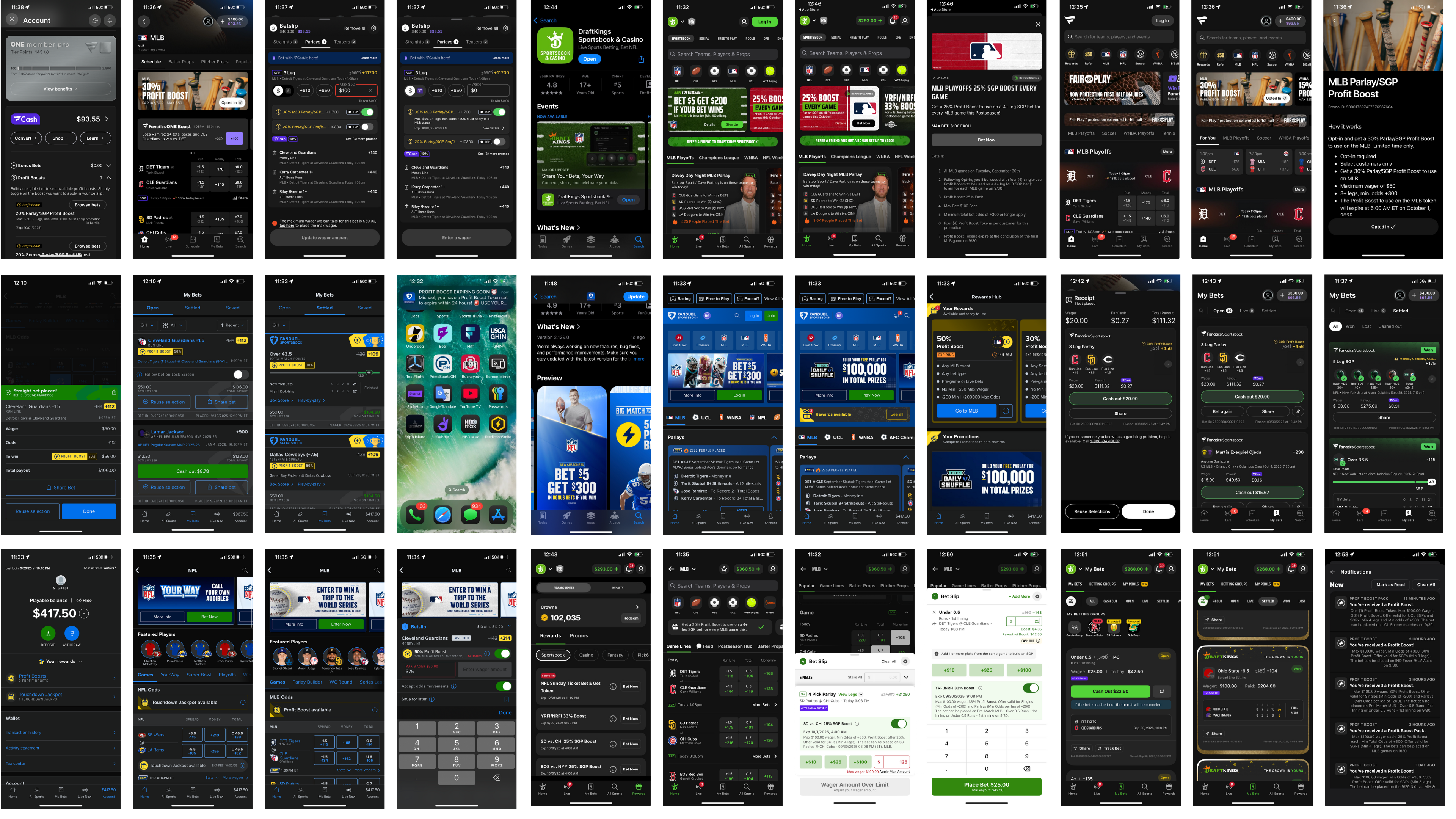
Existing System & Constraints
The existing promotions experience lacked clarity, visibility, and consistency across the application.
Initially, promotions were often auto-applied, with some triggering modals or push notifications. In practice, however, awareness relied heavily on word-of-mouth via Discord, meaning only highly engaged users understood when or how promotions were benefiting them.
Several factors contributed to these challenges:
- A rapid pace of iteration with frequently shifting priorities
- Promotions implemented without corresponding front-end visibility
- Key promotional communications occurring outside the product (email, Discord), with limited in-app feedback
A closer analysis of existing user flows revealed clear opportunities to improve visibility, feedback, and continuity across the promotions experience.
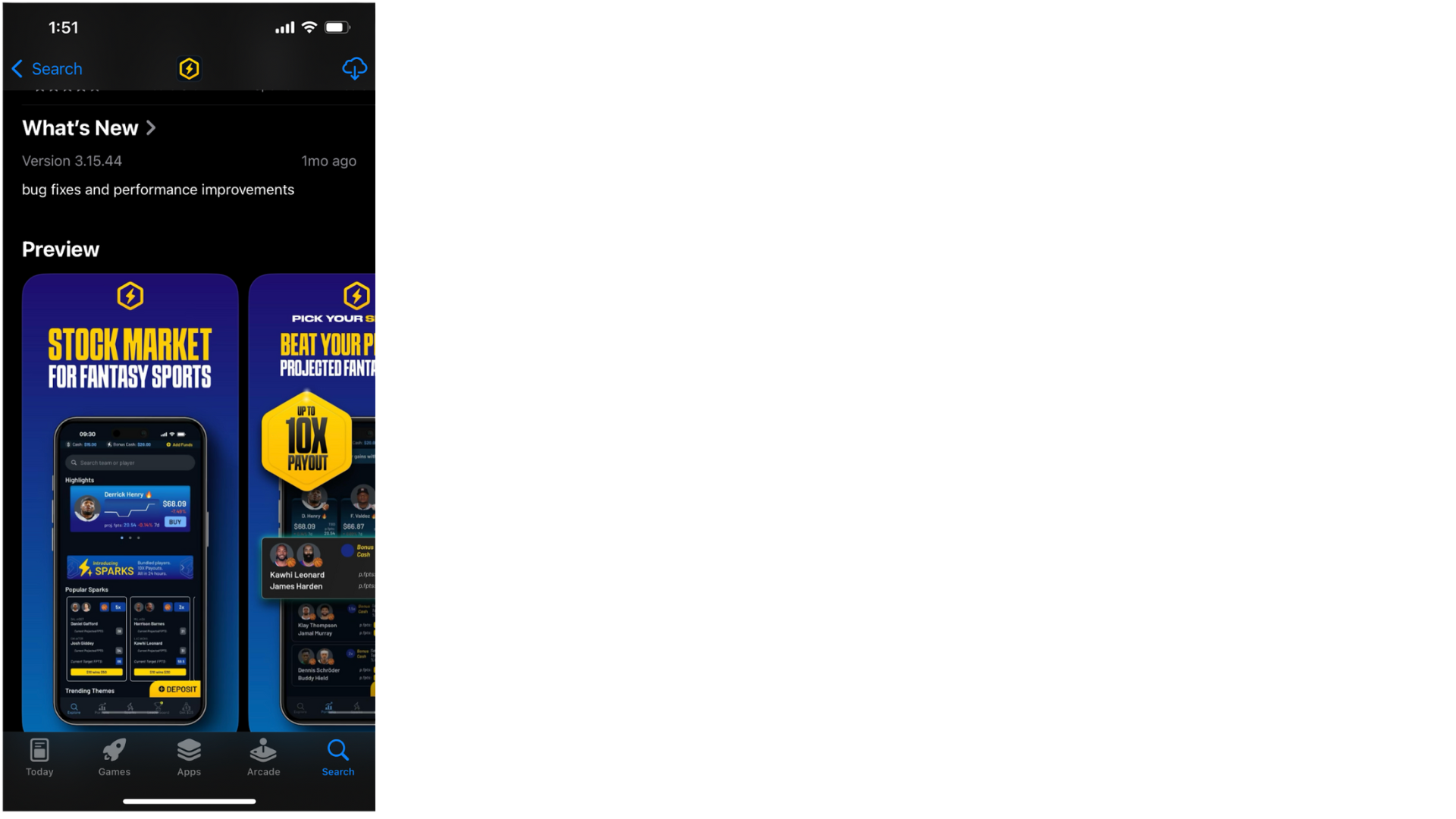
App Store
Our promotions weren’t listed in the app store. We relied on word of mouth or marketing ads.
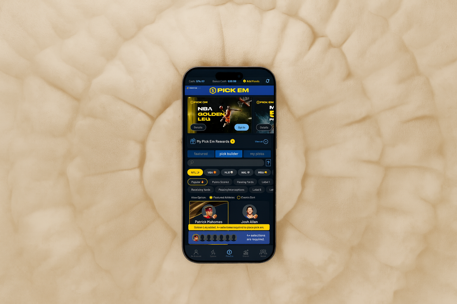
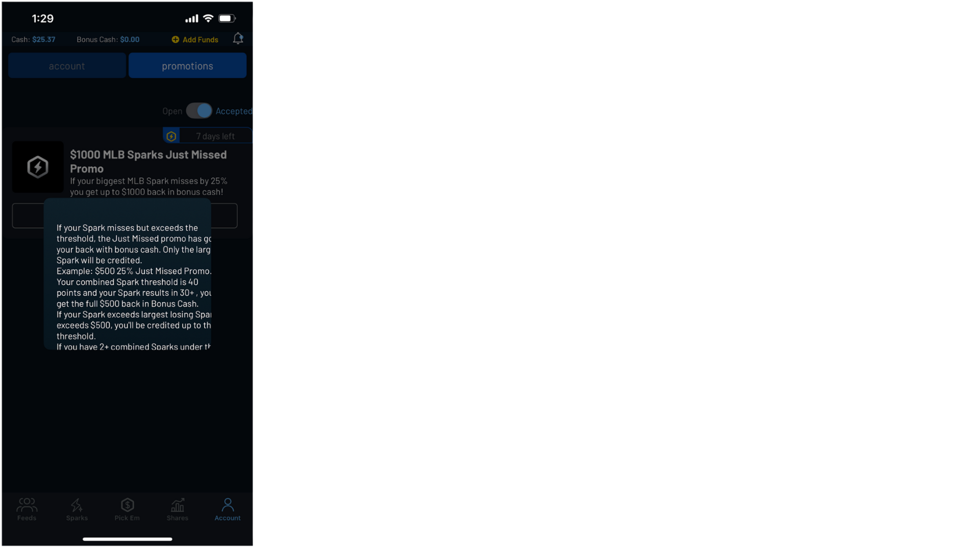
Promotions Screen
The few promotions that did populate in-app were hardly differentiated from each other.
Promotions Descriptions
Promotion descriptions were coming directly from the back-end, with no input from design.
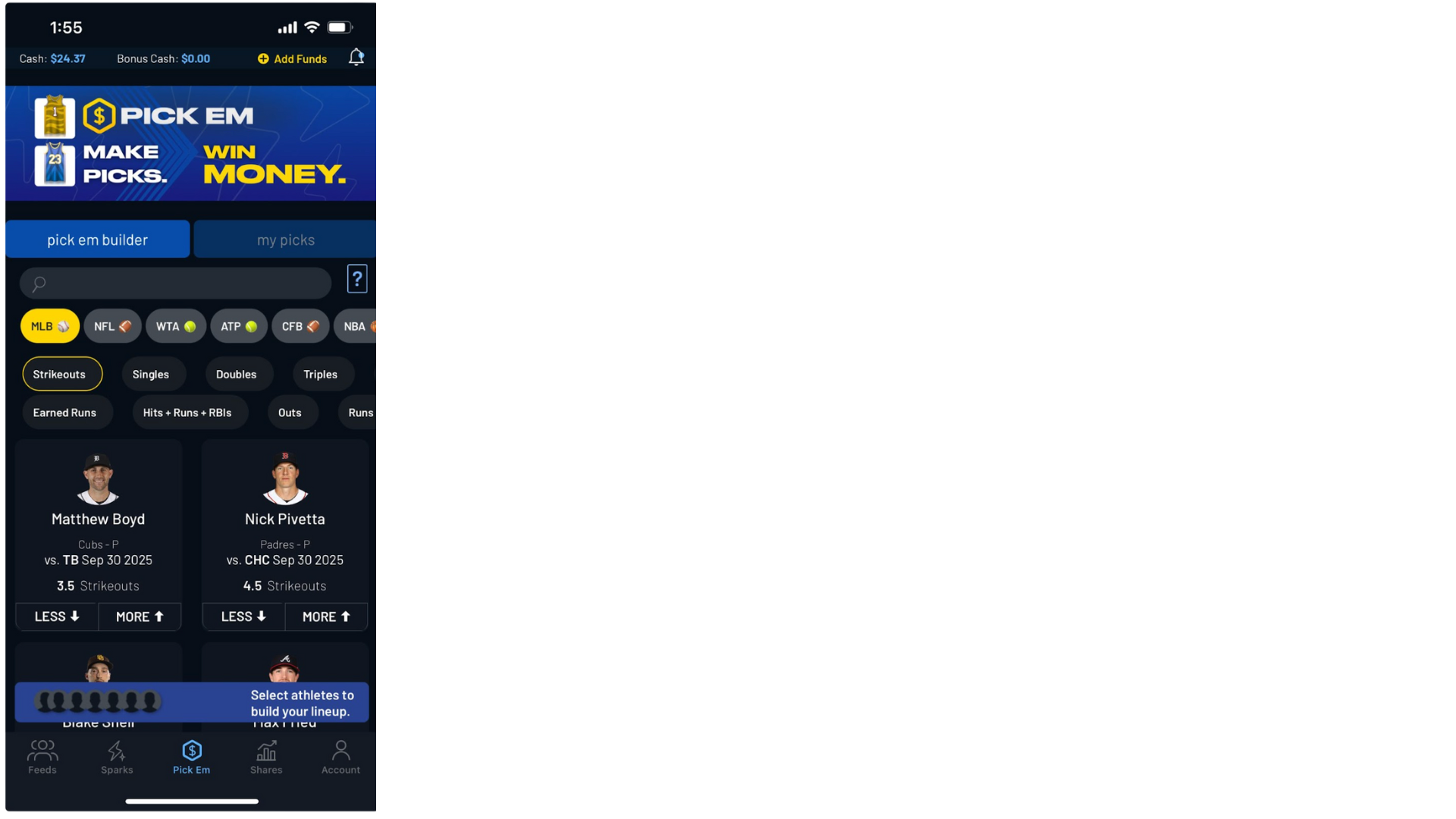
Purchase Flows
Users would opt-in to promotions and receive no promotion-specific directions in any of the purchase flows.
My Shares/Picks/ Sparks
Our promotions weren’t listed in the app store. We relied on word of mouth or marketing ads.

Design Implication:
Feedback & Closure
By synthesizing user feedback and reviewing existing process flows, clear gaps emerged in the interaction design that left users without a sense of continuity or closure.
Users were aware that promotions existed, but outside of Discord, they often lacked confidence that those promotions had actually been applied or paid out.
While promotions provided real value, the experience failed to deliver the sense of feedback or reward typically associated with winning.
Learning from Competitors
Competitive analysis provided insight into how the largest players in our space close the loop from:
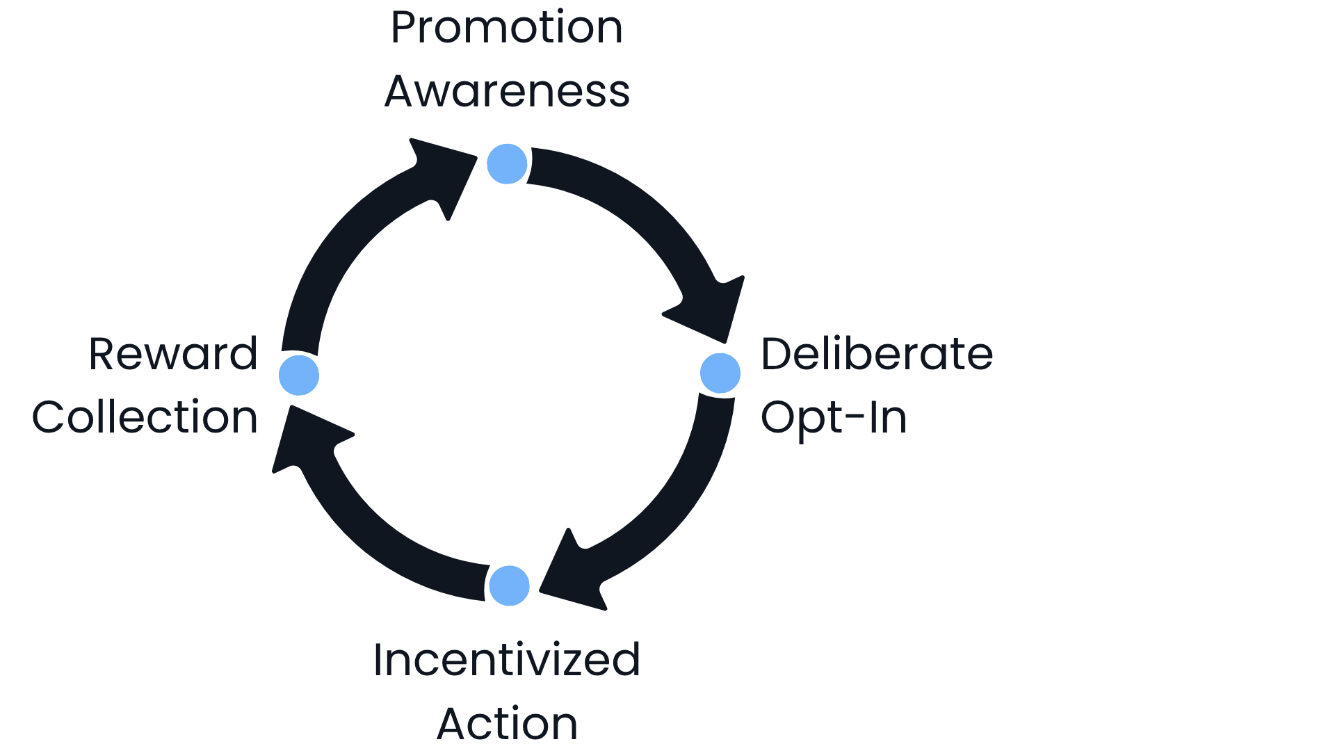
Leading competitors had integrated promotions so effectively that users were conditioned to initiate daily app sessions simply to check for available deals.
The expectation of daily deals encouraged users to browse available lines and bets, reinforcing habitual engagement and repeat app usage.
A Note on Tech Constraints
From the outset, it was clear that this redesign would need to operate within the constraints of the existing promotions engine.
At the system level, promotions could be recognized and rewards issued successfully.
However, it was not feasible in the short term to tie promotion rewards to specific bets or transactions.
The design process was carried out in close collaboration with engineering to ensure short-term feasibility while informing longer-term system planning.
To the Drawing Board
With a clear understanding of user needs and system constraints, the design process focused on identifying where promotions could surface naturally within existing user flows.
The goal was not to introduce new entry points, but to leverage moments users already encountered, ensuring promotions felt integrated rather than disruptive.

Ideation, Testing, and Adjusted Designs
Given time and technical constraints, the focus was on incorporating promotions into the existing environment as seamlessly as possible.
Anticipating the evolving needs of a startup environment, the interface had been designed to be largely modular and block-based.
The promotions effort therefore centered on designing reusable promotion blocks and determining where they would provide the most value across the product.
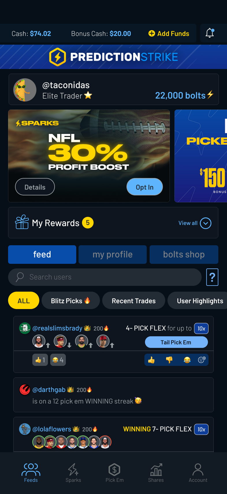
Feeds> Landing Page
Ideation: Feeds
Surface promotions earlier in the user journey. Make promos visually distinct and action-oriented.
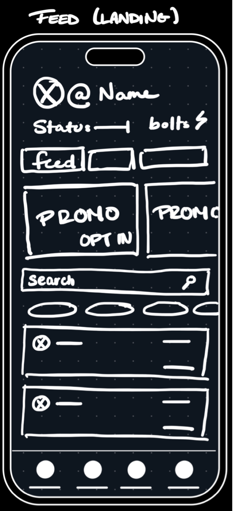
Testing Frames
Opt-in felt intuitive, but users wanted a single place to view all available promotions.
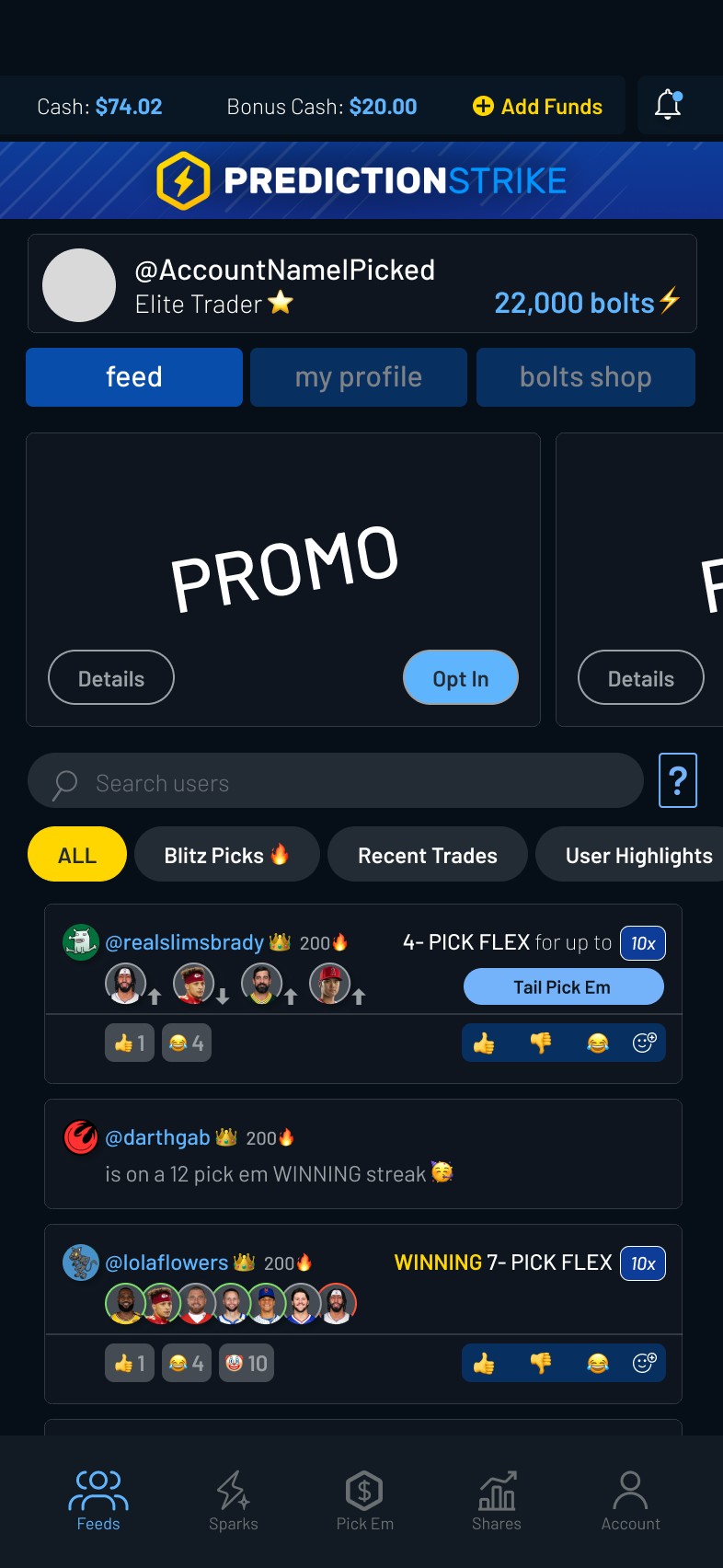
Final Frames
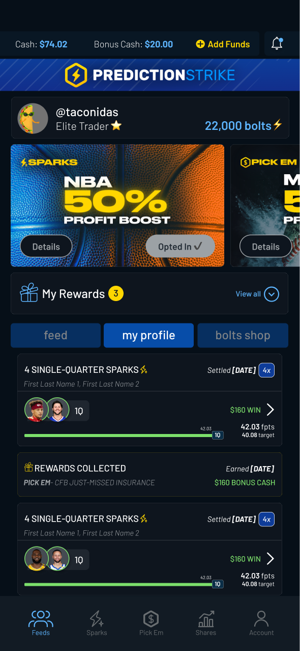
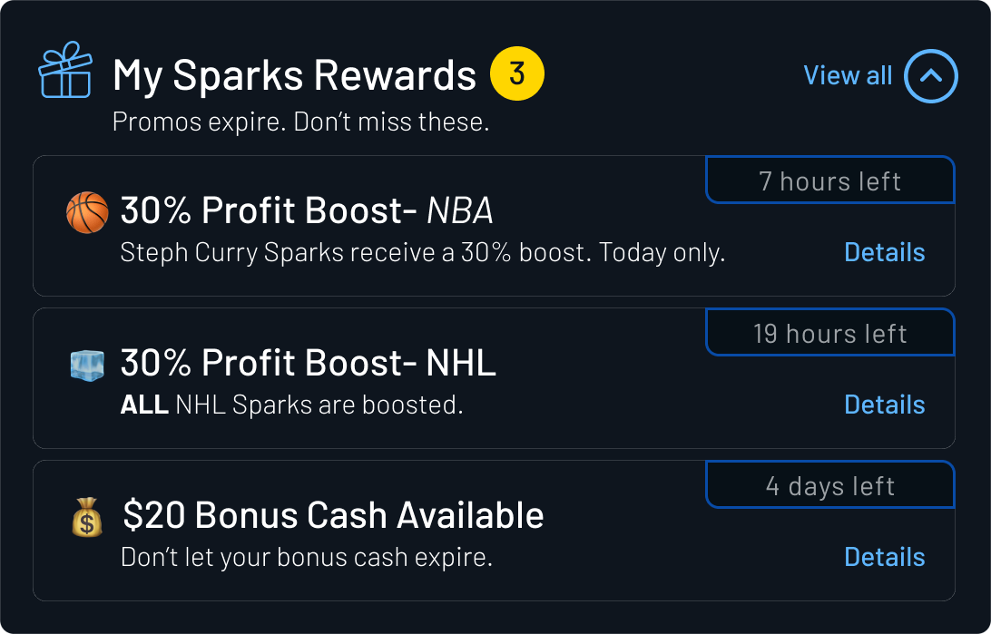
A dedicated “My Rewards” entry point centralized promotion discovery, making promos a visible, recurring part of the feed experience.
Feeds> My Profile
Ideation: My Profile
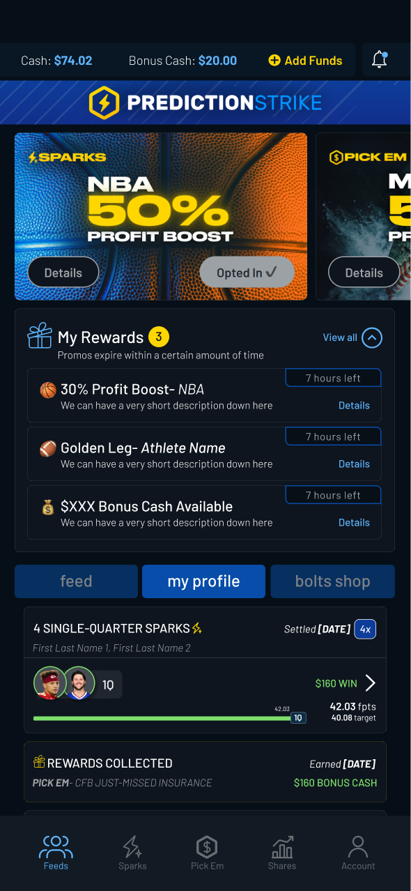
Consolidate all active and completed promotions. Reinforce earned outcomes and reward collection.
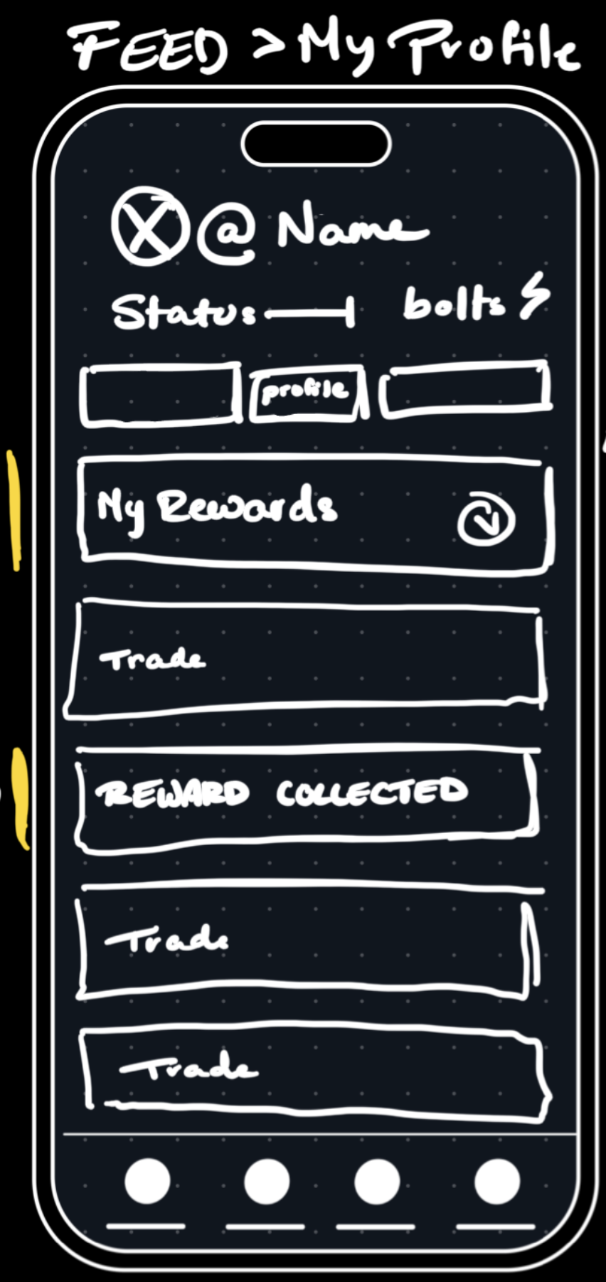
Testing Frames
While users liked the callouts, they wanted clearer visibility into where rewards came from and when they were earned.

Final Frames
(Short-Term Designs)
Engine constraints prevented tying rewards to specific transactions in the short term. The final design prioritized clarity and feedback while supporting future attribution improvements.
Promo Details
Ideation: Promo Details
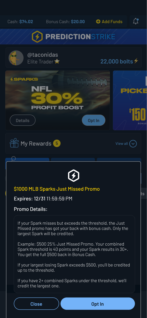
Introduce a promotion-specific details view to provide clarity at the moment of decision.

Testing Frames
Users valued easy access to promotion terms, reinforcing the need for concise, scannable descriptions.


Final Frames
Promotion details were refined alongside brand partners to ensure clarity, consistency, and compliance.
Deliver
Design Elements Added
Incorporating promotions into the PredictionStrike experience required close coordination beyond design — spanning user feedback, leadership alignment, marketing collaboration, and engineering feasibility.
The work focused on making promotions visible, actionable, and emotionally rewarding across the product.
Users Needed:
To clearly see what promotions were available and understand their value.
Design:
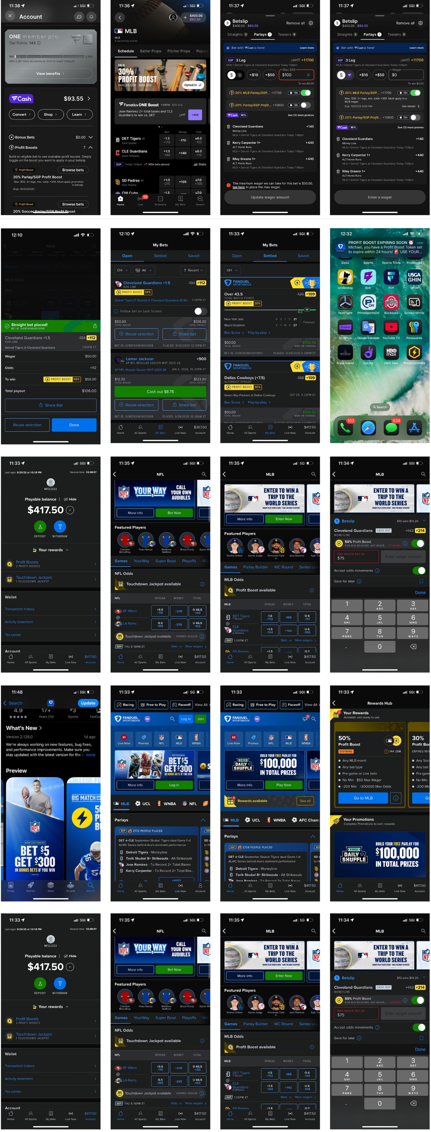
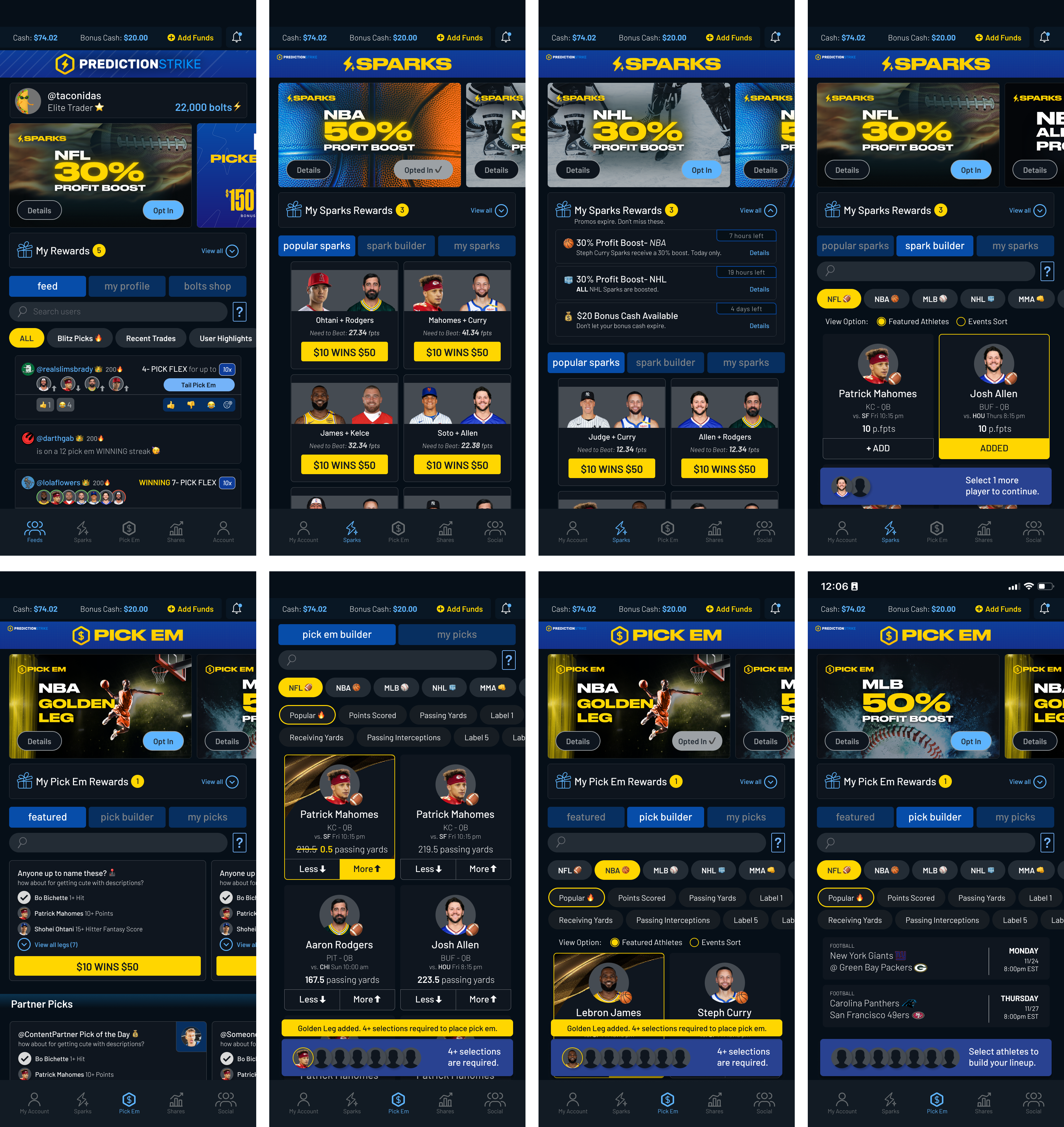
Promotion banners were introduced across key surfaces to replace passive, auto-applied flows.
Clear opt-in CTAs and bold visual treatments encouraged deliberate participation and increased users’ sense of ownership over rewards.

Users Needed:
To know which promotions were usable at any given moment.
Design:
“My Rewards” elements were added across Feed, Sparks, Shares, and Pick Em.
These views surfaced active promotions with clear expiration and eligibility details, making rewards immediately actionable.

Users Needed:
Confirmation that promotions had worked and rewards had been applied.
Design:
Rewards-collected feedback was added to transaction flows.
While rewards could not yet be tied to individual trades, these signals provided immediate closure and reinforced user trust.
Users Needed:
Clear confirmation after opting in and visibility into promotion outcomes.
Design:
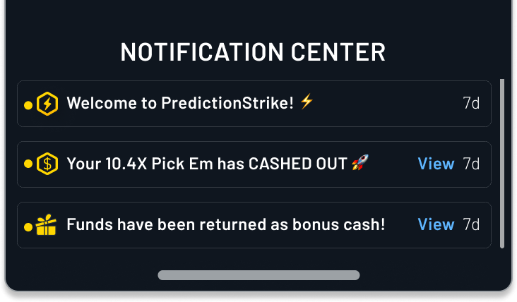
Promotion updates were integrated into the Notification Center and push flows.
This ensured users received timely feedback rather than relying on external channels or implicit system behavior.
Users Needed:
To understand how promotions worked without ambiguity.
Design:
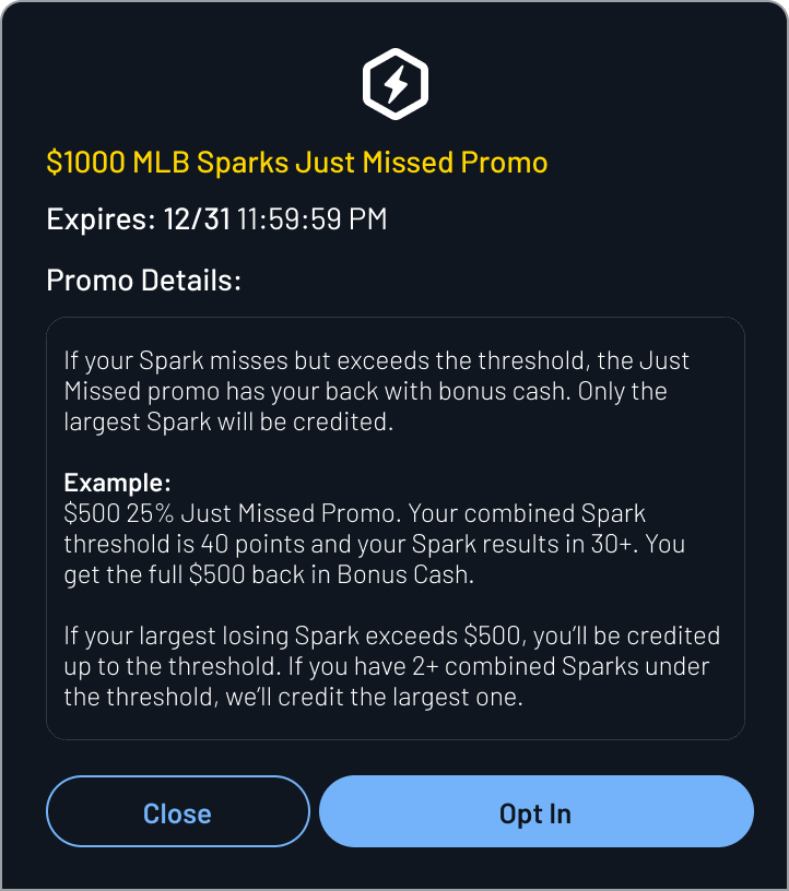
Promotion details modals were introduced wherever promotions were referenced.
These provided consistent access to eligibility, timing, and reward logic across the app.
Result:
Promotions shifted from passive system behavior to visible, intentional user actions with clear feedback loops.
Wrapping Up
Through iterative testing and cross-functional collaboration, this work established a cohesive, end-to-end promotions experience across the PredictionStrike platform.
The system improved visibility, clarified reward status, and reinforced the emotional payoff users expect from winning — while laying the groundwork for deeper attribution in future iterations.
Closing Thoughts
This project was as much about communication and alignment as it was about interface design.
Balancing user needs with technical constraints required close collaboration across design, engineering, marketing, and leadership.
The final experience reflects iterative decision-making, real-world constraints, and a shared focus on delivering clarity, confidence, and momentum to users.
Closing the loop on Promotions
Role
Lead Product Designer (sole designer)
Team
Product, Engineering, Marketing
Timeline
~8 weeks (iterative rollout)
Platform
Mobile app (consumer-facing product)
Problem
Promotions were underutilized, poorly surfaced, and failed to clearly communicate value or reward status to users.
Outcome
- Designed an end-to-end promotions system spanning discovery, engagement, and reward distribution across the app
- Improved user clarity around active promotions and reward status
- Created a scalable foundation for future promotional experiments within existing system constraints
Context & Challenge
Promotions play an important role in engaging users and driving retention, but at PredictionStrike they were underperforming. While promotions existed across the product, they were inconsistently surfaced, difficult to understand, and often failed to clearly communicate value or reward status to users.
Users frequently encountered promotions without clear context — unsure how they were triggered, whether they were eligible, or what had happened after completing a qualifying action. As a result, promotions felt fragmented and disconnected rather than motivating or rewarding.
As the sole product designer on the team, I approached this challenge by rethinking how promotions were experienced across the product — not as isolated moments, but as a cohesive system that users could easily discover, understand, and act on.
Research
Research Insights
Conversations with active users revealed consistent breakdowns in how promotions were surfaced, understood, and reinforced after opt-in.

General Confusion
Users lacked a clear mental model for how promotions worked or when rewards should be expected.

Lack of Communication
After opting in, users received little to no feedback confirming whether a promotion had been applied or paid out.

Missing Enthusiasm
Although promotions provided real value, the experience lacked the sense of reward or excitement typically associated with winning.
In practice, users often opted into promotions without clear confirmation or follow-up. At best, some noticed incremental changes in their bonus cash balance. More often, they weren’t tracking it closely enough to register that a reward had been applied at all.
💰 Bonus Cash is the term used for PredictionStrike’s reward currency.
Most promotion rewards translate to bonus cash.
These insights highlighted gaps not just in surface-level UI, but in how promotions were experienced end to end.
Design
Existing System & Constraints
The existing promotions experience lacked clarity, visibility, and consistency across the application.
Initially, promotions were often auto-applied, with some triggering modals or push notifications. In practice, however, awareness relied heavily on word-of-mouth via Discord, meaning only highly engaged users understood when or how promotions were benefiting them.
Several factors contributed to these challenges:
- A rapid pace of iteration with frequently shifting priorities
- Promotions implemented without corresponding front-end visibility
- Key promotional communications occurring outside the product (email, Discord), with limited in-app feedback
A closer analysis of existing user flows revealed clear opportunities to improve visibility, feedback, and continuity across the promotions experience.
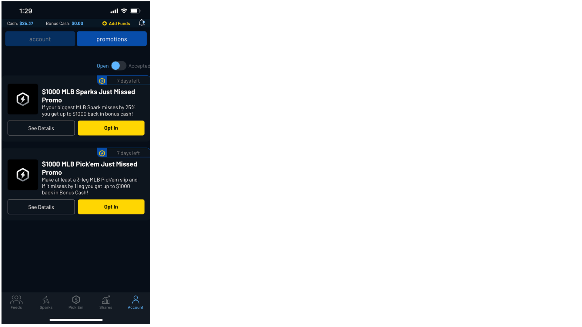
App Store
Our promotions weren’t listed in the app store. We relied on word of mouth or marketing ads.
Promotions Screen
The few promotions that did populate in-app were hardly differentiated from each other.
Promotions Descriptions
Promotion descriptions were coming directly from the back-end, with no input from design.
Purchase Flows
Users would opt-in to promotions and receive no promotion-specific directions in any of the purchase flows.
My Shares/Picks/ Sparks
Our promotions weren’t listed in the app store. We relied on word of mouth or marketing ads.
Design Implication: Feedback & Closure
By synthesizing user feedback and reviewing existing process flows, clear gaps emerged in the interaction design that left users without a sense of continuity or closure.
Users were aware that promotions existed, but outside of Discord, they often lacked confidence that those promotions had actually been applied or paid out.
While promotions provided real value, the experience failed to deliver the sense of feedback or reward typically associated with winning.
Learning from Competitors
Competitive analysis provided insight into how the largest players in our space close the loop from:
Leading competitors had integrated promotions so effectively that users were conditioned to initiate daily app sessions simply to check for available deals.
The expectation of daily deals encouraged users to browse available lines and bets, reinforcing habitual engagement and repeat app usage.
A Note on Tech Constraints
From the outset, it was clear that this redesign would need to operate within the constraints of the existing promotions engine.
At the system level, promotions could be recognized and rewards issued successfully.
However, it was not feasible in the short term to tie promotion rewards to specific bets or transactions.
The design process was carried out in close collaboration with engineering to ensure short-term feasibility while informing longer-term system planning.
To the Drawing Board
With a clear understanding of user needs and system constraints, the design process focused on identifying where promotions could surface naturally within existing user flows.
The goal was not to introduce new entry points, but to leverage moments users already encountered, ensuring promotions felt integrated rather than disruptive.
Ideation, Testing, and Adjusted Designs
Given time and technical constraints, the focus was on incorporating promotions into the existing environment as seamlessly as possible.
Anticipating the evolving needs of a startup environment, the interface had been designed to be largely modular and block-based.
The promotions effort therefore centered on designing reusable promotion blocks and determining where they would provide the most value across the product.
Feeds> Landing Page
Ideation: Feeds
Surface promotions earlier in the user journey. Make promos visually distinct and action-oriented.
Testing Frames
Opt-in felt intuitive, but users wanted a single place to view all available promotions.
Final Frames
A dedicated “My Rewards” entry point centralized promotion discovery, making promos a visible, recurring part of the feed experience.
Feeds> My Profile
Ideation: My Profile
Consolidate all active and completed promotions.Reinforce earned outcomes and reward collection.
Testing Frames
Users valued easy access to promotion terms, reinforcing the need for concise, scannable descriptions.
Final Frames (Short-Term Designs)
Engine constraints prevented tying rewards to specific transactions in the short term. The final design prioritized clarity and feedback while supporting future attribution improvements.

Promo Details
Ideation: Promo Details
Introduce a promotion-specific details view to provide clarity at the moment of decision.
Testing Frames
Users valued the ability to review promotion fine print in context. Testing highlighted the importance of concise, scannable language to prevent cognitive overload while still communicating key conditions.
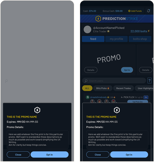
Final Frames
Promotion details were refined alongside brand partners to ensure clarity, consistency, and compliance.
Deliver
Design Elements Added
Incorporating promotions into the PredictionStrike experience required close coordination beyond design — spanning user feedback, leadership alignment, marketing collaboration, and engineering feasibility.
The work focused on making promotions visible, actionable, and emotionally rewarding across the product.
Users Needed:
To clearly see what promotions were available and understand their value.
Design:
Promotion banners were introduced across key surfaces to replace passive, auto-applied flows.Clear opt-in CTAs and bold visual treatments encouraged deliberate participation and increased users’ sense of ownership over rewards.
Users Needed:
To know which promotions were usable at any given moment.
Design:
“My Rewards” elements were added across Feed, Sparks, Shares, and Pick Em.These views surfaced active promotions with clear expiration and eligibility details, making rewards immediately actionable.
Users Needed:
Confirmation that promotions had worked and rewards had been applied.
Design:
Rewards-collected feedback was added to transaction flows.While rewards could not yet be tied to individual trades, these signals provided immediate closure and reinforced user trust.
Users Needed:
Clear confirmation after opting in and visibility into promotion outcomes.
Design:
Promotion updates were integrated into the Notification Center and push flows.This ensured users received timely feedback rather than relying on external channels or implicit system behavior.
Users Needed:
To understand how promotions worked without ambiguity.
Design:
Promotion details modals were introduced wherever promotions were referenced.These provided consistent access to eligibility, timing, and reward logic across the app.
Result:
Promotions shifted from passive system behavior to visible, intentional user actions with clear feedback loops.
Wrapping Up
Through iterative testing and cross-functional collaboration, this work established a cohesive, end-to-end promotions experience across the PredictionStrike platform.
The process had the added benefit of engaging new users that had just come through our onboarding funnel, quickly providing them with value propositions and opportunities to engage with and learn the platform and its products.
Closing Thoughts
This project was as much about communication and alignment as it was about interface design.
Balancing user needs with technical constraints required close collaboration across design, engineering, marketing, and leadership.
The final experience reflects iterative decision-making, real-world constraints, and a shared focus on delivering clarity, confidence, and momentum to users.
Closing the loop on Promotions
Role
Lead Product Designer (sole designer)
Team
Product, Engineering, Marketing
Timeline
~8 weeks (iterative rollout)
Platform
Mobile app (consumer-facing product)
Problem
Promotions were underutilized, poorly surfaced, and failed to clearly communicate value or reward status to users.
Outcome
- Designed an end-to-end promotions system spanning discovery, engagement, and reward distribution across the app
- Improved user clarity around active promotions and reward status
- Created a scalable foundation for future promotional experiments within existing system constraints
Context & Challenge
Promotions play an important role in engaging users and driving retention, but at PredictionStrike they were underperforming. While promotions existed across the product, they were inconsistently surfaced, difficult to understand, and often failed to clearly communicate value or reward status to users.
Users frequently encountered promotions without clear context — unsure how they were triggered, whether they were eligible, or what had happened after completing a qualifying action. As a result, promotions felt fragmented and disconnected rather than motivating or rewarding.
As the sole product designer on the team, I approached this challenge by rethinking how promotions were experienced across the product — not as isolated moments, but as a cohesive system that users could easily discover, understand, and act on.
Research
Research Insights
Conversations with active users revealed consistent breakdowns in how promotions were surfaced, understood, and reinforced after opt-in.

General Confusion
Users lacked a clear mental model for how promotions worked or when rewards should be expected.

Lack of Communication
After opting in, users received little to no feedback confirming whether a promotion had been applied or paid out.

Missing Enthusiasm
Although promotions provided real value, the experience lacked the sense of reward or excitement typically associated with winning.
In practice, users often opted into promotions without clear confirmation or follow-up. At best, some noticed incremental changes in their bonus cash balance. More often, they weren’t tracking it closely enough to register that a reward had been applied at all.
💰 Bonus Cash is the term used for PredictionStrike’s reward currency.
Most promotion rewards translate to bonus cash.
These insights highlighted gaps not just in surface-level UI, but in how promotions were experienced end to end.
Design
Existing System & Constraints
The existing promotions experience lacked clarity, visibility, and consistency across the application.
Initially, promotions were often auto-applied, with some triggering modals or push notifications. In practice, however, awareness relied heavily on word-of-mouth via Discord, meaning only highly engaged users understood when or how promotions were benefiting them.
Several factors contributed to these challenges:
- A rapid pace of iteration with frequently shifting priorities
- Promotions implemented without corresponding front-end visibility
- Key promotional communications occurring outside the product (email, Discord), with limited in-app feedback
A closer analysis of existing user flows revealed clear opportunities to improve visibility, feedback, and continuity across the promotions experience.
App Store
Our promotions weren’t listed in the app store. We relied on word of mouth or marketing ads.
Promotions Screen
The few promotions that did populate in-app were hardly differentiated from each other.
Promotions Descriptions
Promotion descriptions were coming directly from the back-end, with no input from design.
Purchase Flows
Users would opt-in to promotions and receive no promotion-specific directions in any of the purchase flows.
My Shares/Picks/ Sparks
Our promotions weren’t listed in the app store. We relied on word of mouth or marketing ads.
Design Implication: Feedback & Closure
By synthesizing user feedback and reviewing existing process flows, clear gaps emerged in the interaction design that left users without a sense of continuity or closure.
Users were aware that promotions existed, but outside of Discord, they often lacked confidence that those promotions had actually been applied or paid out.
While promotions provided real value, the experience failed to deliver the sense of feedback or reward typically associated with winning.
Learning from Competitors
Competitive analysis provided insight into how the largest players in our space close the loop from:
Leading competitors had integrated promotions so effectively that users were conditioned to initiate daily app sessions simply to check for available deals.
The expectation of daily deals encouraged users to browse available lines and bets, reinforcing habitual engagement and repeat app usage.
A Note on Tech Constraints
From the outset, it was clear that this redesign would need to operate within the constraints of the existing promotions engine.
At the system level, promotions could be recognized and rewards issued successfully.
However, it was not feasible in the short term to tie promotion rewards to specific bets or transactions.
The design process was carried out in close collaboration with engineering to ensure short-term feasibility while informing longer-term system planning.
To the Drawing Board
With a clear understanding of user needs and system constraints, the design process focused on identifying where promotions could surface naturally within existing user flows.
The goal was not to introduce new entry points, but to leverage moments users already encountered, ensuring promotions felt integrated rather than disruptive.
Ideation, Testing, and Adjusted Designs
Given time and technical constraints, the focus was on incorporating promotions into the existing environment as seamlessly as possible.
Anticipating the evolving needs of a startup environment, the interface had been designed to be largely modular and block-based.
The promotions effort therefore centered on designing reusable promotion blocks and determining where they would provide the most value across the product.
Feeds> Landing Page
Ideation: Feeds
Surface promotions earlier in the user journey.Make promos visually distinct and action-oriented.
Testing Frames
Opt-in felt intuitive, but users wanted a single place to view all available promotions.
Final Frames
A dedicated “My Rewards” entry point centralized promotion discovery, making promos a visible, recurring part of the feed experience.
Feeds> My Profile
Ideation: My Profile
Consolidate all active and completed promotions.Reinforce earned outcomes and reward collection.
Testing Frames
While users liked the callouts, they wanted clearer visibility into where rewards came from and when they were earned.
Final Frames (Short-Term Designs)
Engine constraints prevented tying rewards to specific transactions in the short term. The final design prioritized clarity and feedback while supporting future attribution improvements.
Promo Details
Ideation: Promo Details
Introduce a promotion-specific details view to provide clarity at the moment of decision.
Testing Frames
Users valued easy access to promotion terms, reinforcing the need for concise, scannable descriptions.
Final Frames
Promotion details were refined alongside brand partners to ensure clarity, consistency, and compliance.
Deliver
Design Elements Added
Incorporating promotions into the PredictionStrike experience required close coordination beyond design — spanning user feedback, leadership alignment, marketing collaboration, and engineering feasibility.
The work focused on making promotions visible, actionable, and emotionally rewarding across the product.
Users Needed:
To clearly see what promotions were available and understand their value.
Design:
Promotion banners were introduced across key surfaces to replace passive, auto-applied flows.Clear opt-in CTAs and bold visual treatments encouraged deliberate participation and increased users’ sense of ownership over rewards.
Users Needed:
To know which promotions were usable at any given moment.
Design:
“My Rewards” elements were added across Feed, Sparks, Shares, and Pick Em.These views surfaced active promotions with clear expiration and eligibility details, making rewards immediately actionable.
Users Needed:
Confirmation that promotions had worked and rewards had been applied.
Design:
Rewards-collected feedback was added to transaction flows.While rewards could not yet be tied to individual trades, these signals provided immediate closure and reinforced user trust.
Users Needed:
Clear confirmation after opting in and visibility into promotion outcomes.
Design:
Promotion updates were integrated into the Notification Center and push flows.This ensured users received timely feedback rather than relying on external channels or implicit system behavior.
Users Needed:
To understand how promotions worked without ambiguity.
Design:
Promotion details modals were introduced wherever promotions were referenced.These provided consistent access to eligibility, timing, and reward logic across the app.
Result:
Promotions shifted from passive system behavior to visible, intentional user actions with clear feedback loops.
Wrapping Up
Through iterative testing and cross-functional collaboration, this work established a cohesive, end-to-end promotions experience across the PredictionStrike platform.
The system improved visibility, clarified reward status, and reinforced the emotional payoff users expect from winning — while laying the groundwork for deeper attribution in future iterations.
Closing Thoughts
This project was as much about communication and alignment as it was about interface design.
Balancing user needs with technical constraints required close collaboration across design, engineering, marketing, and leadership.
The final experience reflects iterative decision-making, real-world constraints, and a shared focus on delivering clarity, confidence, and momentum to users.